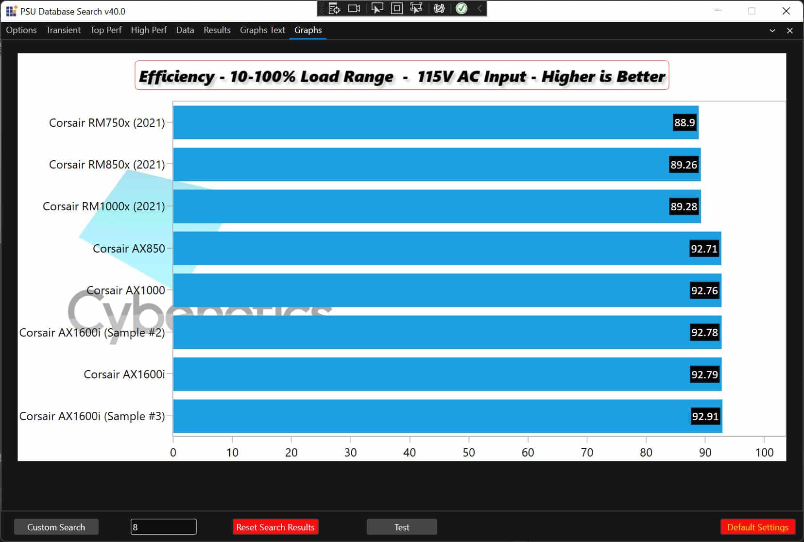
In a recent video, I introduced an application that I wrote in C#, which utilizes Cybenetic’s entire PSU database to perform every possible query. But this wasn’t enough, my colleagues wanted more, I could say. Although we have a good web platform to make custom graphs, and the application above already outputs compatible files, they also asked me to code a graphs module. I knew this would be challenging, but I moved forward anyway since I love coding!
I use Syncfusion’s excellent packages, and in this case, I will exploit the SfChart WPF plugin. It has many options and settings; unfortunately, I will have to use most of them. But let’s take it from the beginning. The first thing you have to do is to add an SfChart element into XAML.
The full code I used is given below:
<chart:SfChart Canvas.ZIndex=”1″ x:Name=”Chart1″ Margin=”10,8,10,33″ Background=”White”
AreaBorderThickness=”0,1,1,1″ AreaBorderBrush=”DarkGray” >
<syncfusion:SfChart.Resources>
<DataTemplate x:Key=”postfixLabelTemplate”>
<TextBlock FontSize=”12″ VerticalAlignment=”Center”/>
</DataTemplate>
</syncfusion:SfChart.Resources>
<chart:SfChart.Header>
<TextBlock FontSize=”22″ Foreground=”Black”
FontFamily=”Segoe UI” Margin=”0,0,0,20″>Test</TextBlock>
</chart:SfChart.Header>
<chart:SfChart.PrimaryAxis>
<chart:CategoryAxis Foreground=”Black”
LabelTemplate=”{StaticResource labelTemplate}”
AxisLineStyle=”{StaticResource AxisStyle}”
MajorTickLineStyle=”{StaticResource AxisStyle}”>
</chart:CategoryAxis>
</chart:SfChart.PrimaryAxis>
<chart:SfChart.SecondaryAxis>
<chart:NumericalAxis
Foreground=”Black” LabelTemplate=”{StaticResource labelTemplate}”
AxisLineStyle=”{StaticResource AxisStyle1}”
MajorTickLineStyle=”{StaticResource AxisStyle}”/>
</chart:SfChart.SecondaryAxis>
</chart:SfChart>
I set the chart’s header and the primary and secondary axis in the XAML code above. The header part is not required since I will set it dynamically through code, but I wanted the chart to look nice even when I didn’t start the code to fill it with data.
Let’s go to the interesting part now, the C# code.
I use this method to create the charts
public void Create_Charts(List<List<Single_GraphData_Entry>> Entire_GraphData_List)
Which takes as input a list of lists containing all data for the charts. I initially thought to have a single chart showing all 70-80 charts the application produces in series while saving them. This way, I won’t need dozens of tabs for all these charts, which are not standard. A user can select to either make only one, two, three, or more. So why bother having many chart elements on my application and make it messy? I always pay extra attention to a friendly UI (user interface) because this is what makes a good application great!
I have to clear the chart first!
Chart1.Series.Clear();
The following code builds the header title of the chart!
Border border = new Border()
{
BorderThickness = new Thickness(0.5),
BorderBrush = new SolidColorBrush(Colors.Red),
Margin = new Thickness(10),
CornerRadius = new CornerRadius(5)
};
TextBlock textBlock = new TextBlock()
{
Text = “Test”,
Foreground = Brushes.Black,
Margin = new Thickness(5),
FontSize = 22,
FontStyle = FontStyles.Italic,
FontWeight = FontWeights.UltraBold
};
textBlock.Effect = new DropShadowEffect()
{
Color = Colors.Black,
Opacity = 0.2
};
border.Child = textBlock;
Chart1.HorizontalHeaderAlignment = HorizontalAlignment.Center;
ChartAdornmentInfo adornmentInfo = new ChartAdornmentInfo()
{
ShowLabel = true,
LabelPosition = AdornmentsLabelPosition.Inner,
Foreground = new SolidColorBrush(Colors.White),
BorderBrush = new SolidColorBrush(Colors.Black),
Background = new SolidColorBrush(Colors.Black),
BorderThickness = new Thickness(1),
Margin = new Thickness(1),
FontStyle = FontStyles.Normal,
FontFamily = new FontFamily(“Calibri”),
FontSize = 16
};
I need to add a watermark!
//Watermark
Chart1.Watermark = new Watermark()
{
HorizontalAlignment = HorizontalAlignment.Left,
VerticalAlignment = VerticalAlignment.Center
};
string sfd = string.Format(@”{0}\{1}\{2}”, Environment.CurrentDirectory, “images”, “cybenetics_30_opacity.png”);
Chart1.Watermark.Content = new Image()
{
Height = 500,
Width = 500,
Source = new BitmapImage(new Uri(sfd, UriKind.Absolute))
};
The X-axis end is very close to the chart’s border, so it doesn’t show well. For example, the “100” label is partially hidden. I have to do something about that!
//Add padding to the end of X Axis
Chart1.SecondaryAxis.PlotOffsetEnd = 30;
And the most important part of the creation of the charts goes here!
int counter = 0;
foreach (var item in Entire_GraphData_List)
{
textBlock.Text = item[counter].Graph_title + ” – ” + item[counter].Graph_subtitle + ” – ” + item[counter].Higher_or_lower_is_better;
//Color Graph_Color = item[counter].Color_code;
Chart1.Header = border;
Chart1.Series.Add(
new BarSeries
{
LegendIcon = ChartLegendIcon.Rectangle,
AdornmentsInfo = adornmentInfo,
//IsSortData = true,
//SortBy = SortingAxis.X,
//SortDirection = Direction.Ascending,
ItemsSource = item,
XBindingPath = “Category”,
YBindingPath = “Value”,
SegmentColorPath = “Color_code”,
Name = “Series” + counter.ToString(),
}
); ;
counter++;
}
I don’t need the sorting options because I have already sorted the data that I send to the chart, but I left these options to show you the capabilities of Syncfusion’s API. You can also see that I use an Itemsource and bind the Category and Value variables to my chart. I loop through each item’s elements and put them all together into the chart. I use a counter to get the header information for each graph.
The Entire_GraphData_List holds all charts that I want to create, so I take every time one of its items to form a single graph. The idea is to cycle through all elements of the Entire_GraphData_List, make the corresponding graph, save it, and move to the next. The good thing with this option is that I will only need one chart to make and save everything. On the other hand, there is no preview option which is essential, so I will have to find a way to make a preview possible even with a single chart element available.
Well, this was a part of my PSU Database Application. If you have any questions or comments, please leave them below.


